At Secret Escapes, we want to create an enjoyable and seamless experience for our members; from browsing and booking to storing all the useful trip information in their account. That’s why we are continuously developing and improving our web platform and apps, to provide a tailored and effortless experience for each user.

In the last six months, the mobile apps team, quirkily named “No Doubt” have been focusing on providing a frictionless user experience, by delivering structural changes to the iOS and Android apps. Reducing friction was our starting point, as we wanted to streamline our customers’ experience, to help each one find the best trips that are tailored to their search requirements.
After that, one of the biggest implementations we have been working on is the ability to deep-link our app users from an email to inside the app. During the pandemic, our business model changed and evolved rapidly, with our catalogue of deals growing by almost 15 times in one year. Consequently, our team has been working on projects like deep-linking, so we can assist customers in navigating their way through this enormous amount of choice while maintaining optimum performance speeds. This technical challenge alone is massive!
Now, when a member clicks on an email link, they are sent directly to a specific in-app location, instead of being sent to our mobile website. As well as improving UX, this also means we can optimise our marketing campaigns around a single deal, stage or part of our catalogue without worrying about user navigation. Email continues to be one of our most successful marketing channels and ensuring we make the experience consistent for app members is important. Since we’ve added that functionality, we have seen our retention increase by 10% in the apps!
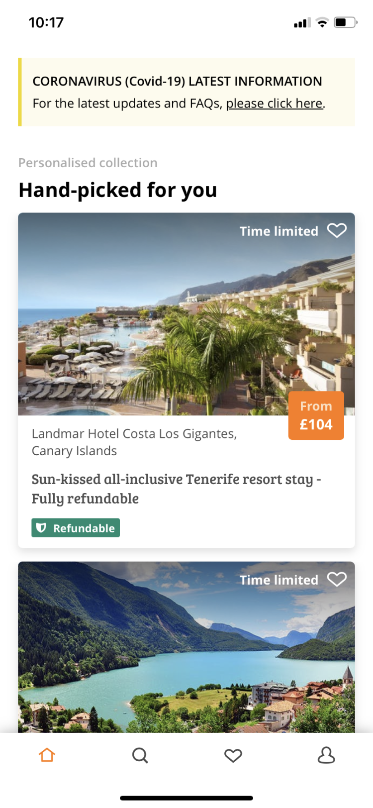
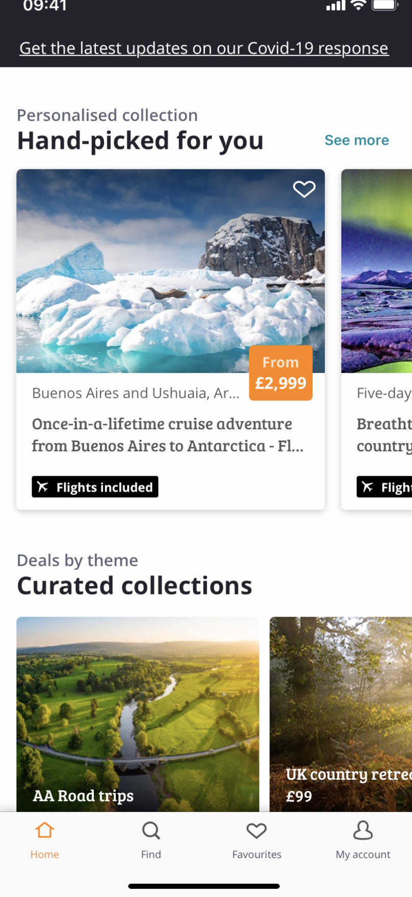
In the last few months, we have also been interviewing & surveying our members within the apps, then going through the feedback in order to understand the browsing pain points in our mobile applications. We discovered that our app homepage, which is naturally the most visited page, was too long for some. This made it hard to distinguish between each section, so some of the important content was easily being missed. From that, a new hypothesis emerged: to improve retention and ultimately conversion, we would need better presentation tactics that provide context for why we are showing content.
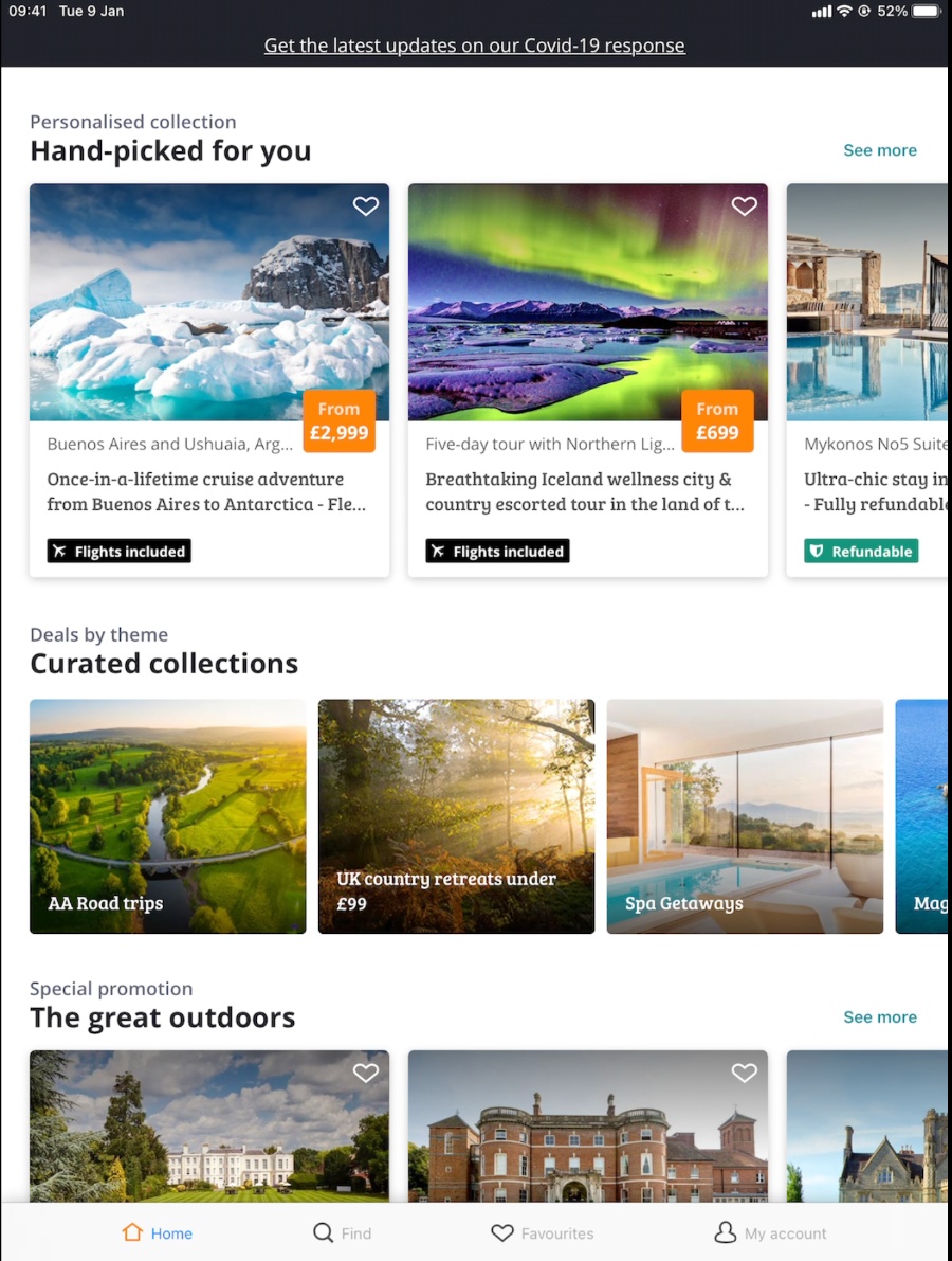
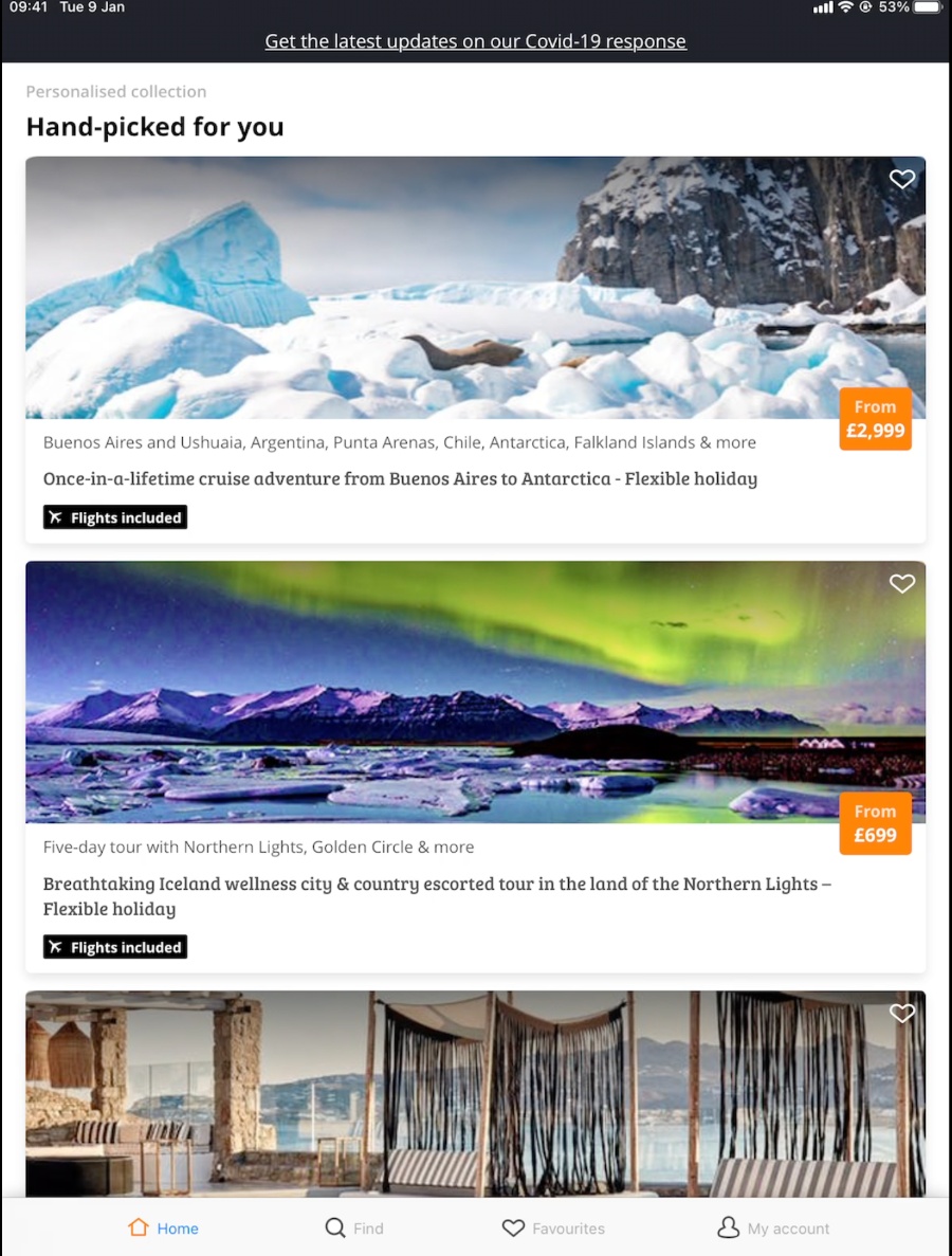
We are excited to say we are just a few weeks from getting our first changes in front of our members. These changes include improving the navigation of the app homepage with clearly defined deal sections and improved navigation tools to help users find their dream destinations faster, plus deliver improved deal recommendations. We are also thinking about how to optimise the experience for our tablet users, as the audience is also growing on these devices. We will make changes incrementally, using a backend driven UI approach that allows us to make modular changes to the different sections and their order on the page. We will then be able to efficiently measure, test, learn and adapt our content strategy to deliver the best experience to our app users.
Iphone before
Iphone after
Ipad after
Ipad before
Most recently, we have changed our search technology on both the website and the apps, which now means that search results load 20% faster than before.
Every day we learn, test, build and iterate incremental changes to the mobile apps. We continue investing in researching our customers’ needs to enable them to find the right deals faster, smarter and in an enjoyable way.